How Moscow Metro’s iconic ‘M’ changed over time (PHOTOS + VIDEO)
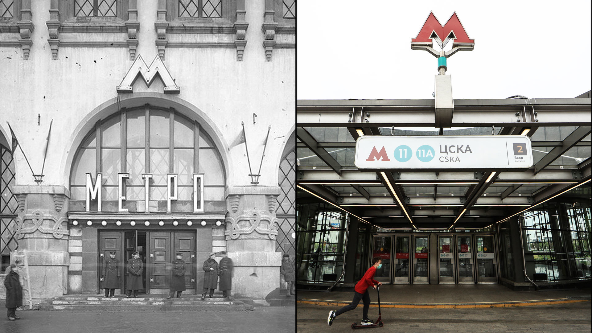
“Subway logo design competition. For the best entries <...> the following five prizes will be awarded:
First prize: 2,000 rubles.
2 second place prizes: 1,000 rubles each.
2 third place prizes: 500 rubles.”
So read a newspaper ad in 1934, which marks the start of the logo’s history. At that time, for comparison, a university lecturer received about 4,000 rubles a year.
Construction of the subway system itself was well underway, yet it had no defining symbol. So, the project management announced a nationwide competition open to all citizens. But the results were disappointing. There were only 97 submissions and all were rejected (the 1,000- and 500-ruble prizes were still awarded in order not to offend anyone).
In the end, the task was assigned to professional architects. The designer of the Moscow Metro logo is considered to be architect Ivan Taranov, who, together with his wife Nadezhda Bykova, created a symbol for the very first station of the new transport system, Sokolniki.
A large letter ‘M’ duly appeared above this and subsequent stations, together with a bulky ‘Metro’ sign. All design elements were three-dimensional with electric illumination at night.
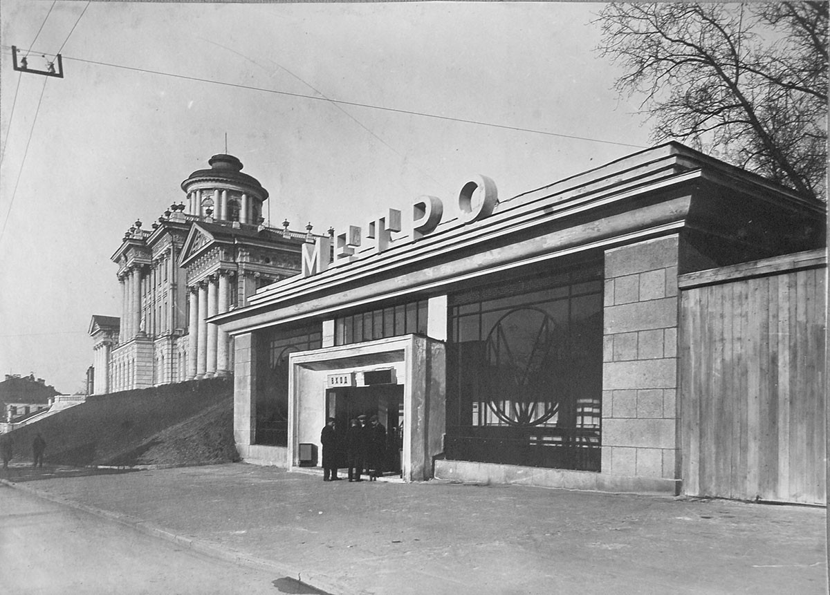
Metro station Biblioteka imeni Lenina, 1935
Metro Press ServiceLater, the ‘Metro’ signs were scrapped so as not to distract attention from the architecture of the station lobbies, leaving only a single-letter ‘M’ symbol, which Muscovites quickly got used to, Andrey Komarov and Mikhail Shulga, experts on the history of the Moscow Metro, explains.
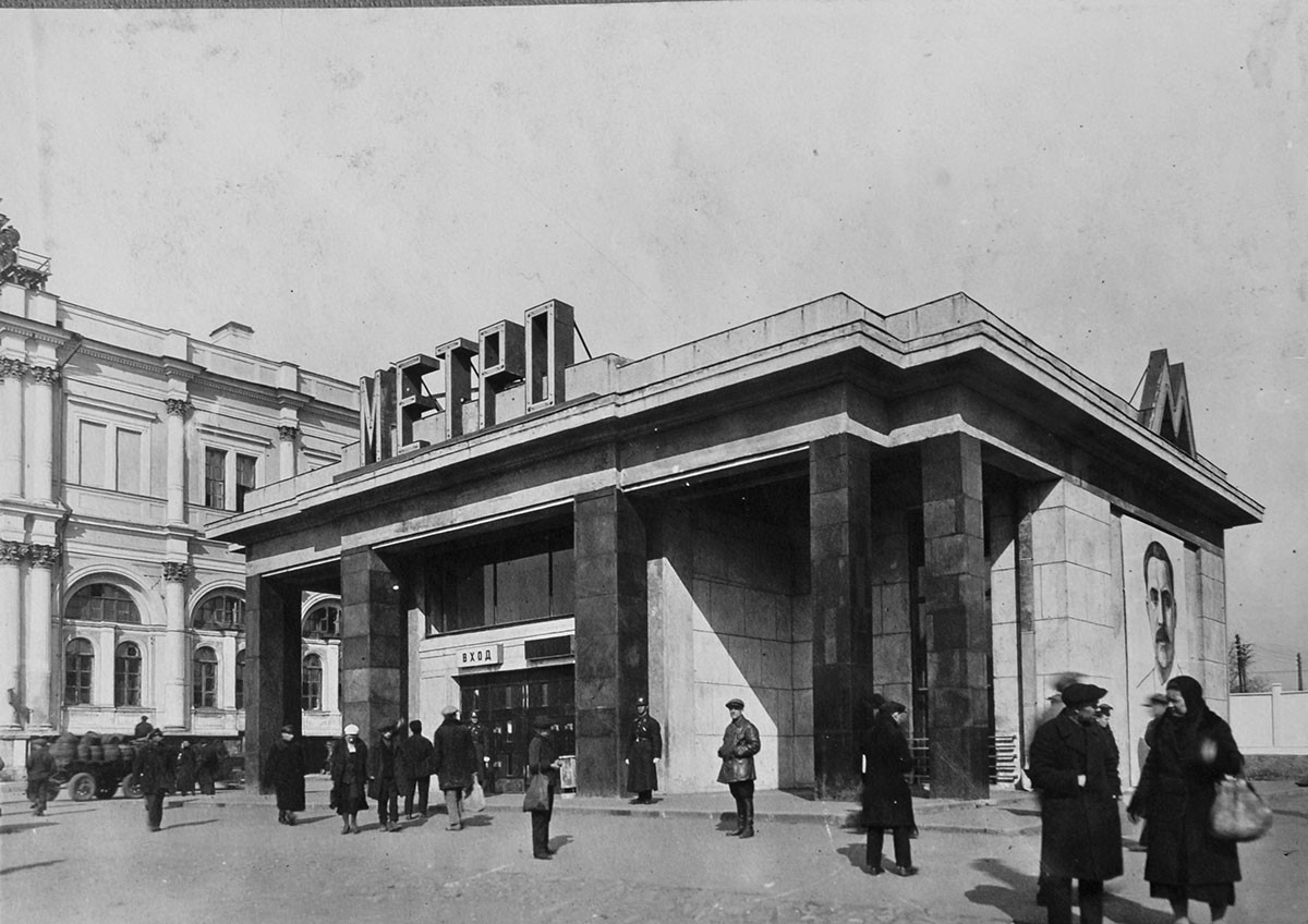
Vestibule of Komsomolskaya st., 1935
-Vestibule of Komsomolskaya st.As of 1943, all stations only bore the famous ‘M’, although there was no specific standard at the time; the symbol at the station entrances differed from the printed version that appeared, for example, in newspapers and on employee ID cards and tickets.
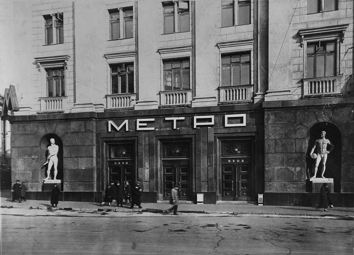
Okhotny Ryad. Old lobby
Metro Press ServiceIn 1950, when the Circle Line was opened, the first standardized logo appeared in the new station lobbies: The letter ‘M’ with gray-colored serifs and a bright red neon tube illuminated at night.
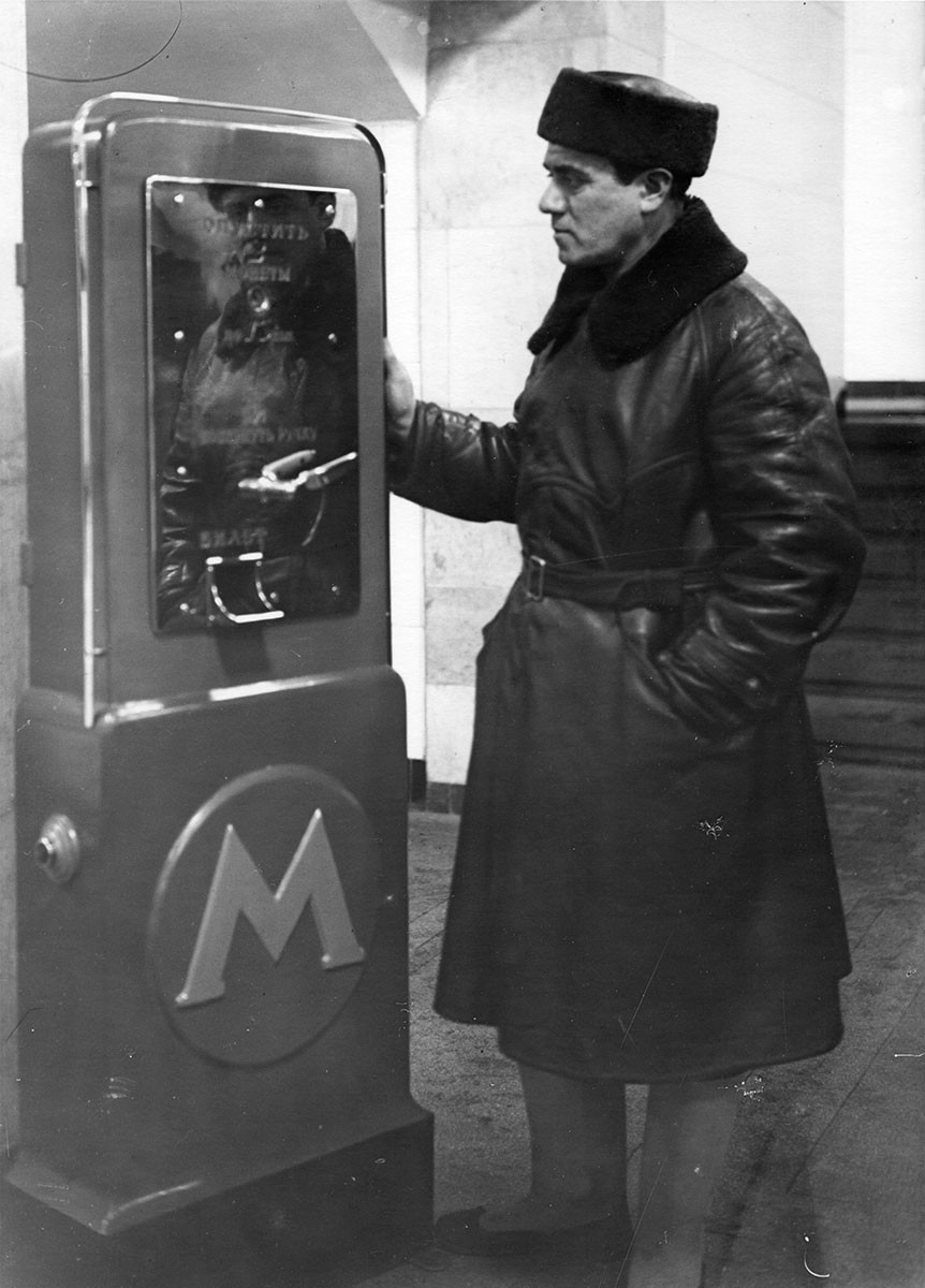
In 1967, the architectural institute ‘Metrogiprotrans’ developed a new signage system. The ‘M’ symbol was now supposed to be the same on all maps and tickets and at station entrances and lobbies. However, the plan was only partially implemented and it was not possible to harmonize everything. The symbol itself was also modified with a black circle around the ‘M’, which was changed in the 1980s to the symbolic, blue-colored outline of a tunnel.
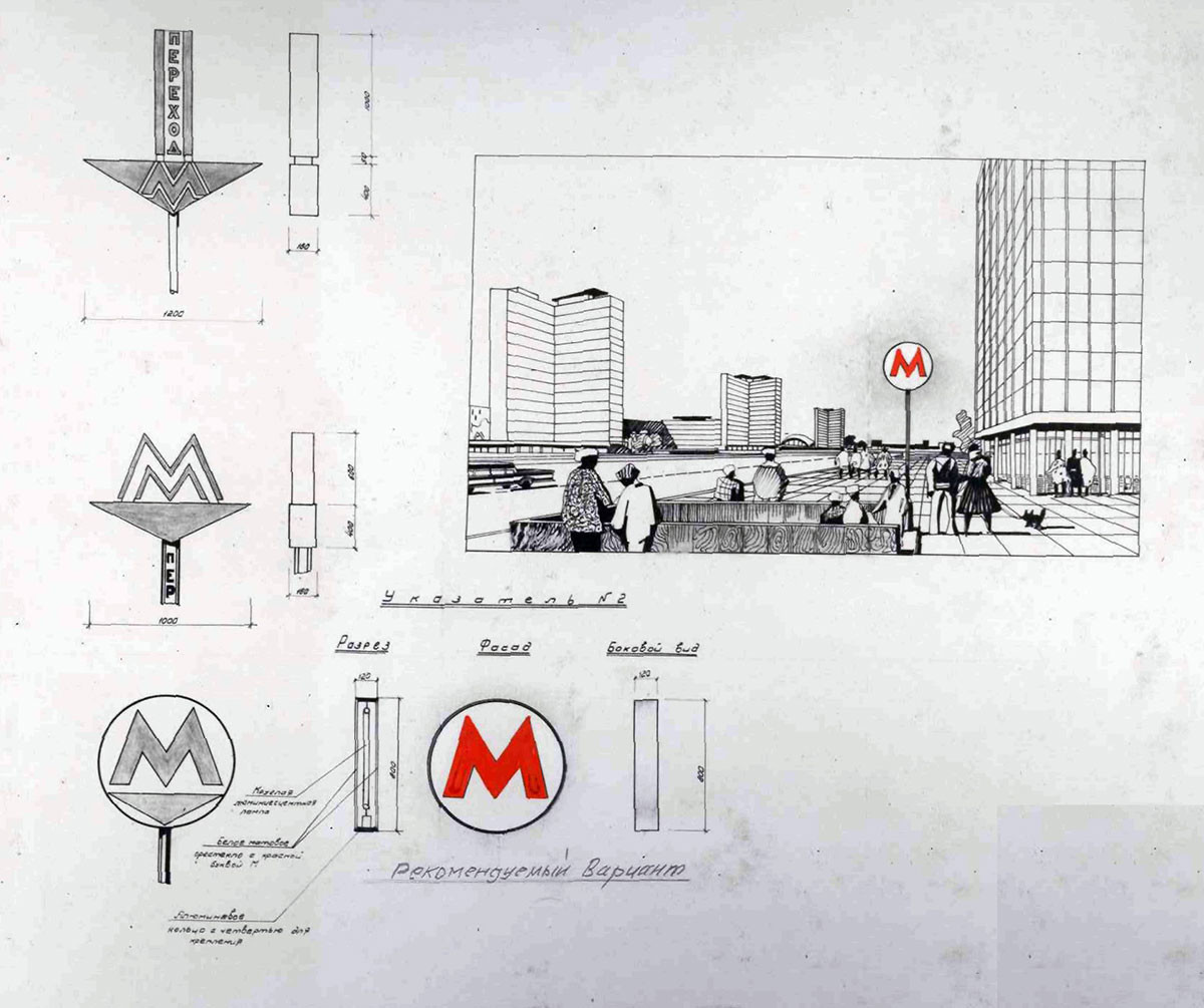
Layout
Metro Press ServiceAfter the collapse of the USSR in the 1990s, a sans serif frame outline of the letter was used for entrance signs and, in 1996, the letter ‘M’ was bordered by a kind of red garland.
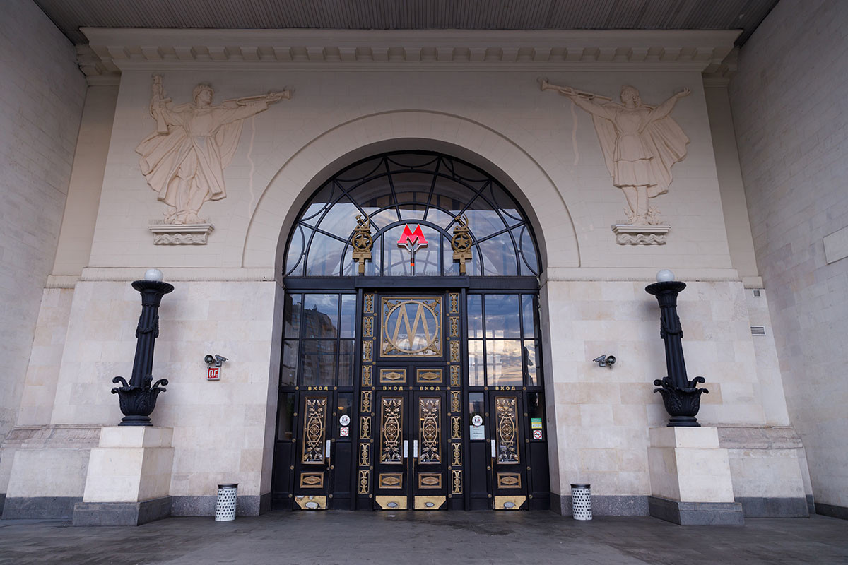
Once again, there were no standards and each designer was free to depict the symbol on subway-related printed matter as they pleased.
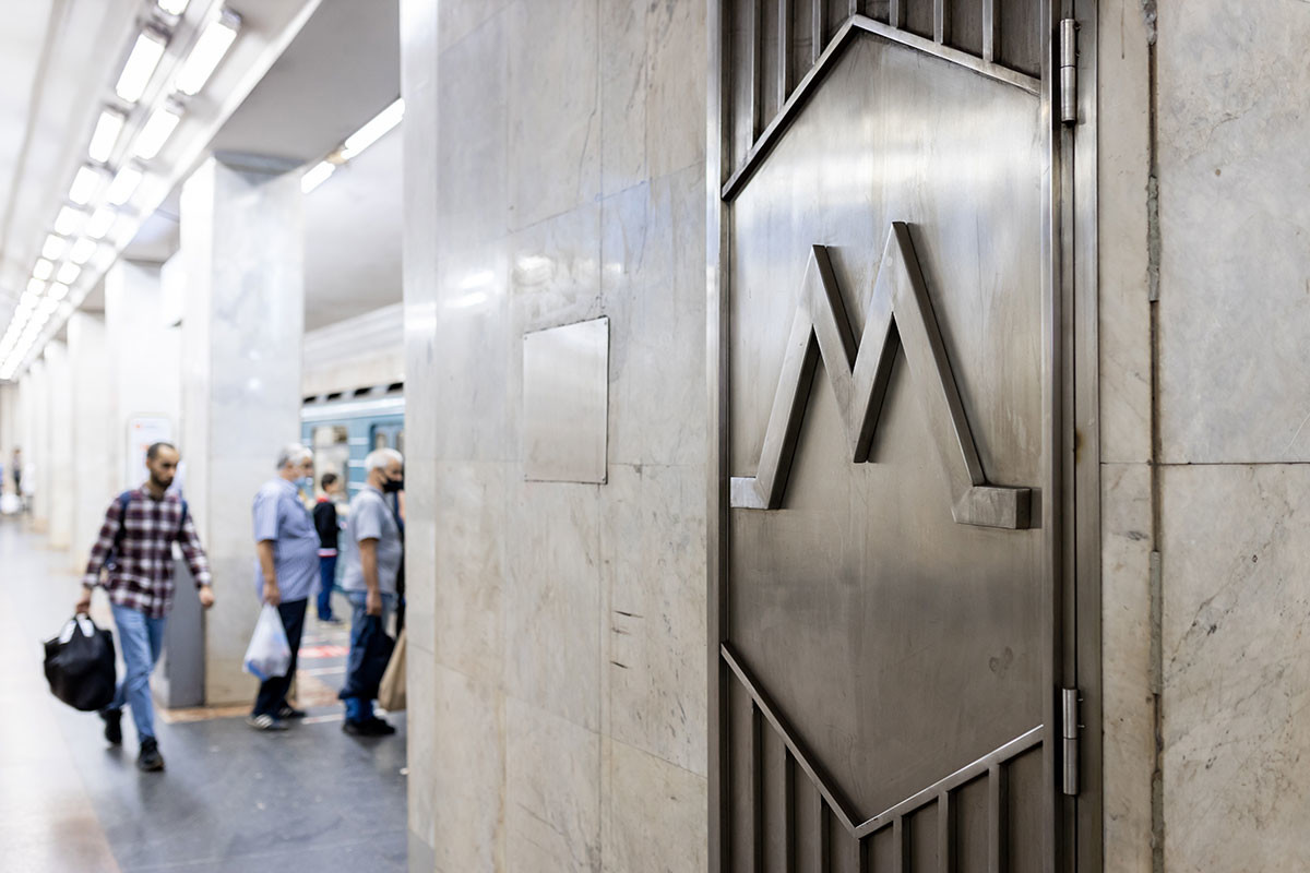
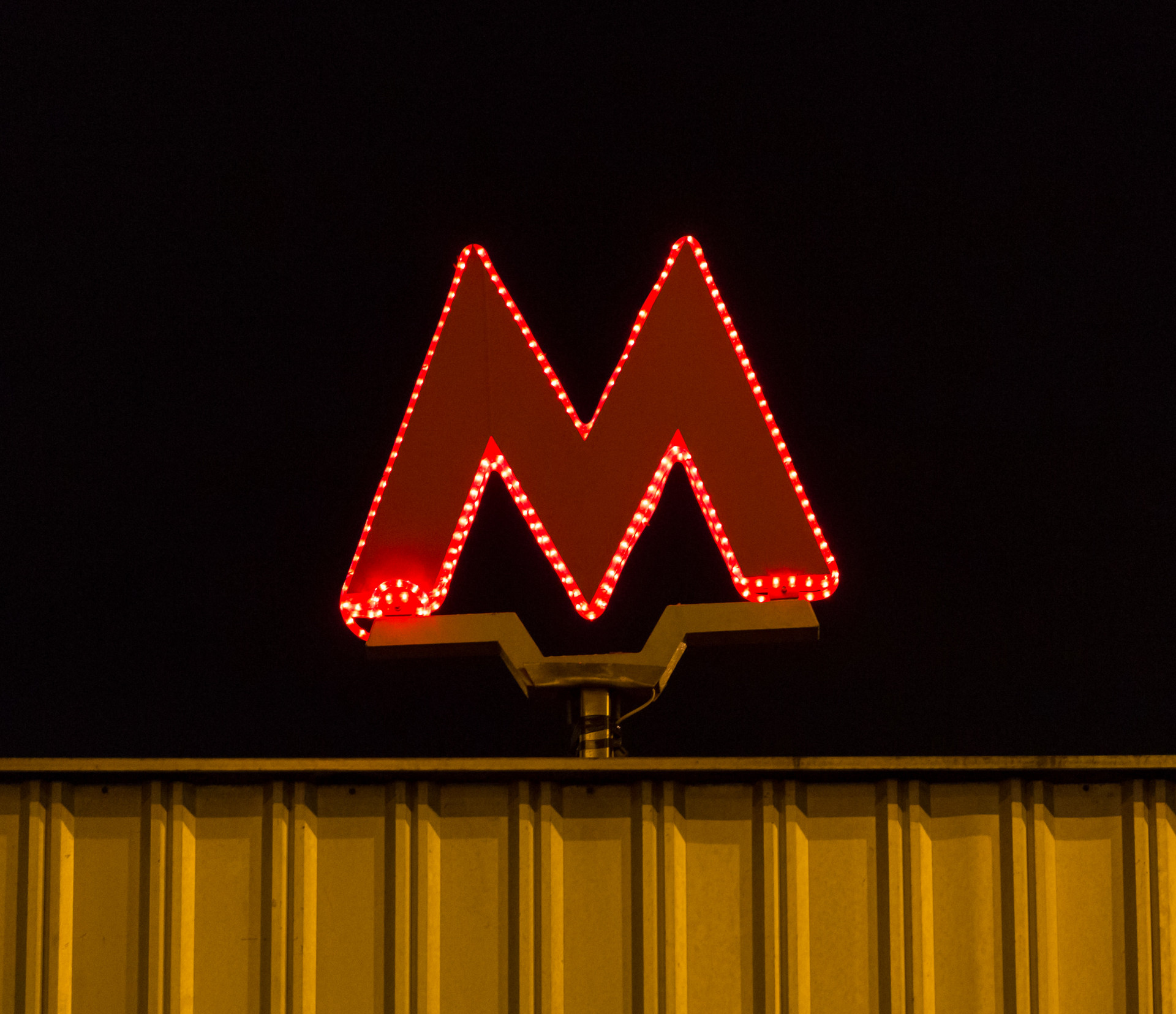
A single format for all symbols appeared only in 2014, developed by the ‘Art. Lebedev Studio’.
The logo became a big ‘M’ with serifs, no background and no bordering.
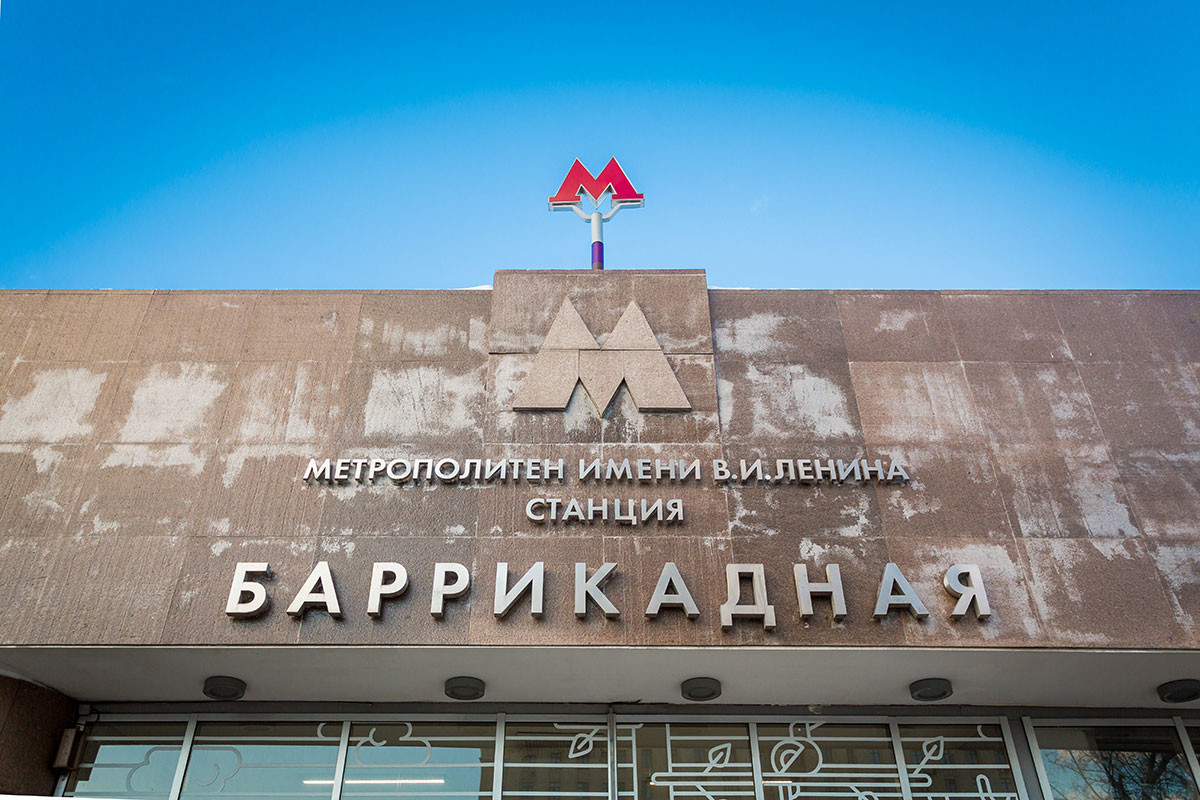
Lebedev also created a grander version of the letter with neon tubes, but it was not used anywhere.
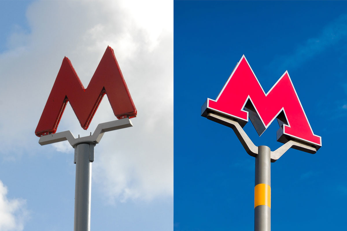

Finally, in 2016, the logo was placed inside a track-shaped red loop, forming part of the ‘Moscow Transport’ brand image.
If using any of Russia Beyond's content, partly or in full, always provide an active hyperlink to the original material.
Subscribe
to our newsletter!
Get the week's best stories straight to your inbox